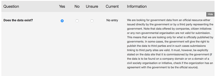
In the open data census each question has some associated text that is used on the submission page.
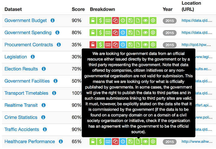
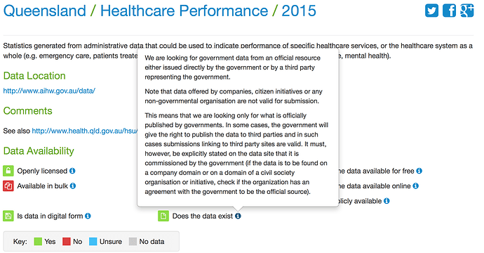
When used as tool tips on the place and dataset pages, this text is very long and does not display well due to its length.
I would like to propose shorter text for the nine questions. (I will do this as a set of nine topics, this being the first).
Question 1: Does the data exist?
Currently:
We are looking for government data from an official resource either issued directly by the government or by a third party representing the government. Note that data offered by companies, citizen initiatives or any non-governmental organisation are not valid for submission. This means that we are looking only for what is officially published by governments. In some cases, the government will give the right to publish the data to third parties and in such cases submissions linking to third party sites are valid. It must, however, be explicitly stated on the data site that it is commissioned by the government (if the data is to be found on a company domain or on a domain of a civil society organisation or initiative, check if the organization has an agreement with the government to be the official source).
Proposed:
Data must come from an official resource either issued directly by the government or by a third party representing the government. Data offered by companies, citizen initiatives or any non-governmental organisation are not valid for submission.
If the government has given the right to publish the data to third parties, a submission with a link a to third party site is allowed. The third-party site must explicitly state that the data has been commissioned by the government. Check if the organization has an agreement with the government to be the official source.
What do you think?


