Maybe @Mor in relation to the index and @rufuspollock in relation to the Open Knowledge Labs could tell me their opinion about this. Of course other opinions and ideas are more than welcome.
Could we make a dynamic web visualisation out of our own “data earth” logo to represent changes in the open index in 2016? I think it would be a good way to blend our own branding into our goal of helping nations across enhance their openness.
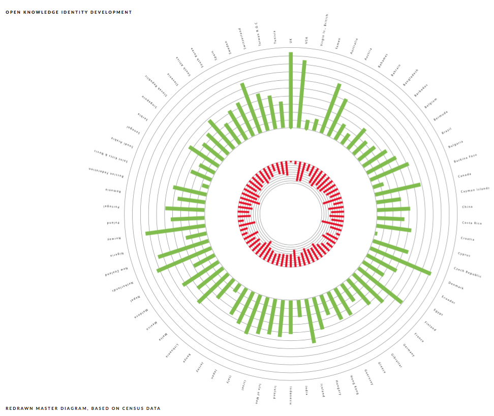
I know the “data earth” logo back in 2014 represented the data of all measured countries on the 2013 index, which is cool because our logo derived from data, but also sad because it is static and I’m running around with a t-shirt that
subtly shows how bad my country did back then.
Wouldn’t it be cool to have a sort of dynamic branded logo that changes (hopefully for the best) every year due to efforts of the community itself?
Now, I have no coding skills or design skills, but this has been lingering for quite a while in my mind.
Super interesting! I think the best person to speak about this in OKI would actually be @sam
To the point, there are some issues in changing logo each year, mainly because of the fact that you need to put time and efforts in changing the logo on all of our assets.
About this logo, how do you know which line is Belgium? Also, countries are actually less open every year, because our methodology is getting better. That can affect the logo a lot…
(just putting all of my thoughts here, not saying this is a bad idea, but i do have a lot of questions about it.)
In that case @sam, please join our conversation. Happy to hear what you think.
@Mor, I would NOT recommend changing ALL of our assets based on the change. I think it would be a cool way to show the dynamic, a bit like the ODD generator of OKFN Japan. I would be cool however that the logo would downloadable in a vector file so that people can use that as part of the stories they tell locally (Eg. when talking to governments about data and its evolution).
About our line: Yes I thought the data earth logo with reference to each line was on the OKFN Wiki, but I can’t seem to find it (also the images are down). Belgium is one of the tiny lines somewhere in the upper right side. I think we were number 56 of 90 something countries back then.
And yes I’m well aware about countries being less open every year. Cf. The NL vs. BE discussion during the Open Belgium Conference on Slide five. So ideally we all want a perfect sun with all lines on maximum height, which is something we should strive for, but you can’t really start that conversation with the current logo, as the data it represents is dated.
Again, seems a cool sideproject, not something that should determine our branding and logo.
I think this a great idea, that could reinforce our (let’s be honest, slightly confusing) logo. I’m sure this would have been part of the branding agency’s vision too.
I think it’s important that we have a consistent logo, especially for items such as a T-shirt.
The problem for me is, that our current logo is (and would be confirmed as) in essence, an outdated version of this dynamic vision we are discussing. I would be in favour of our logo being a simplified representation of the dynamic visualisation. Something that alludes to, but does not contain the data. I made this argument at the time of the logo conception, but I don’t think it made it back to the branding agency.
+1 to getting a logo that won’t need an annual refresh… Are there any other ideas for a static logo that is related to the dynamic year-on-year results of the Index?
The Leadership Team (that’s Pavel, Mark and Sander) are definitely open to a wider discussion about our logo and branding, so please do add suggestions for this and related points.
@PJPauwels thanks for getting this started, even we are now discussing the branding rather than a side-project! Do move this to a new thread if it’s not helpful for your original suggestions.
Let’s not get distracted by talk of changing the official/static logo (though it’s nice to know there is room for this discussion). My concern above was pretty minor (and could be dealt with in time). I wouldn’t want it to hold up or discourage work on this dynamic version
I agree with @sam, if we can have a sort of dynamic “data earth” tool that can assign data of max two columns (green lines and red lines), then we can see from there how we can implement this in our communication and branding efforts.
Ideally you could highlight one or more lines and afterwards export them into a transparent PNG or Vector SVG format.
Eg. to show which country your are on the index and how you relate to others. We often get the question what the Belgian line is.